evo Community Microsite Optimization
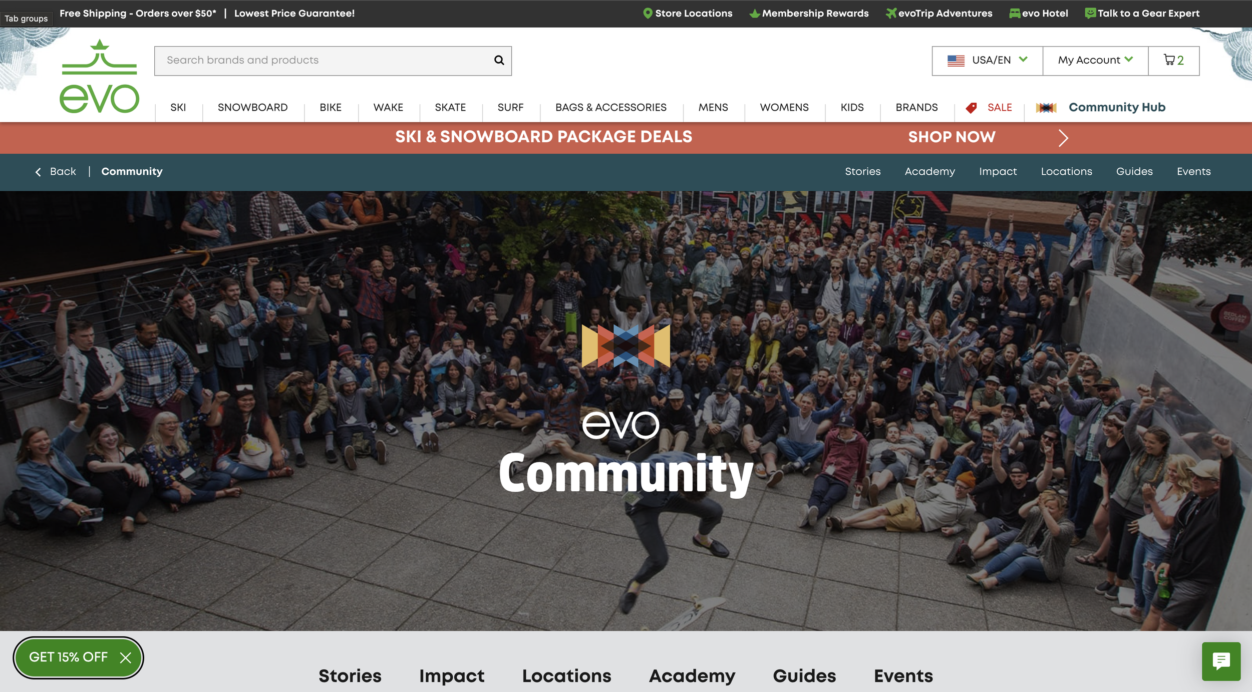
evo Community Hub
Evo is not just a retailer. Their community impact makes them stand out from their competitors. Optimizing their community microsite helps to make them stand out even more.
-
evo is an outdoor experiences company and online retailer who specializes in ski, snowboard, mountain bike, skate and wake surf while also providing rentals, service, lodging and experiences.
-
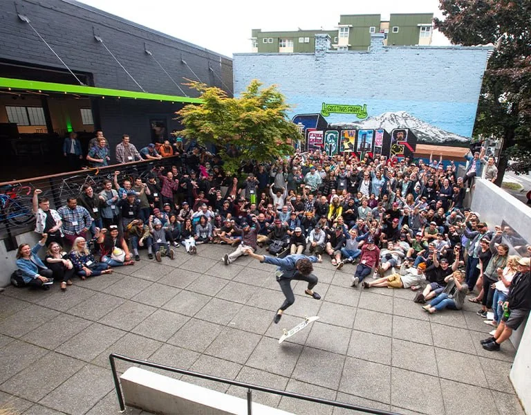
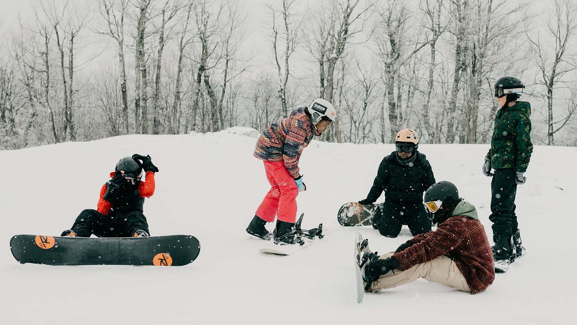
evo believes in giving back to the community, especially uplifting the organizations that empower youth to get outdoors.
-
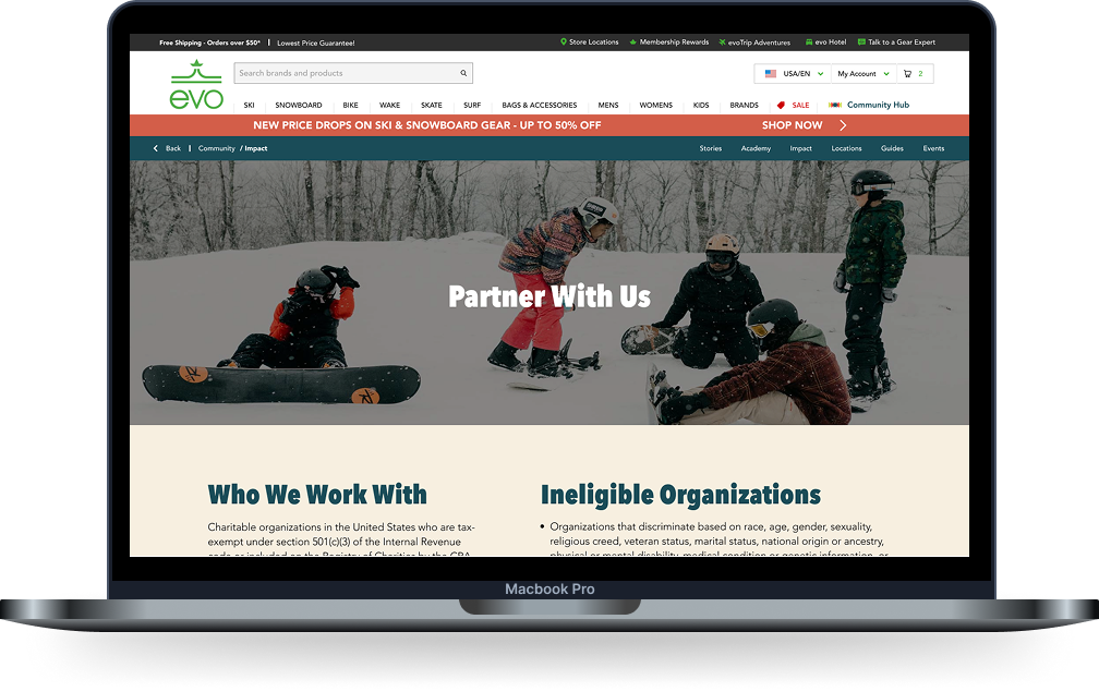
evo partners with non-profit organizations that reduce barriers to getting young people outside by providing grant funding, providing gear to young folks, volunteering, and more.
If it ain’t broke, don’t fix it.
The goal of this project was to optimize, not to change what was already working. We had already determined that evo’s Community Impact is an integral part of the company, and therefore, the website as well. The existing site hosts great information and resources. So, there began the research process to determine what was working, and where it could improve.
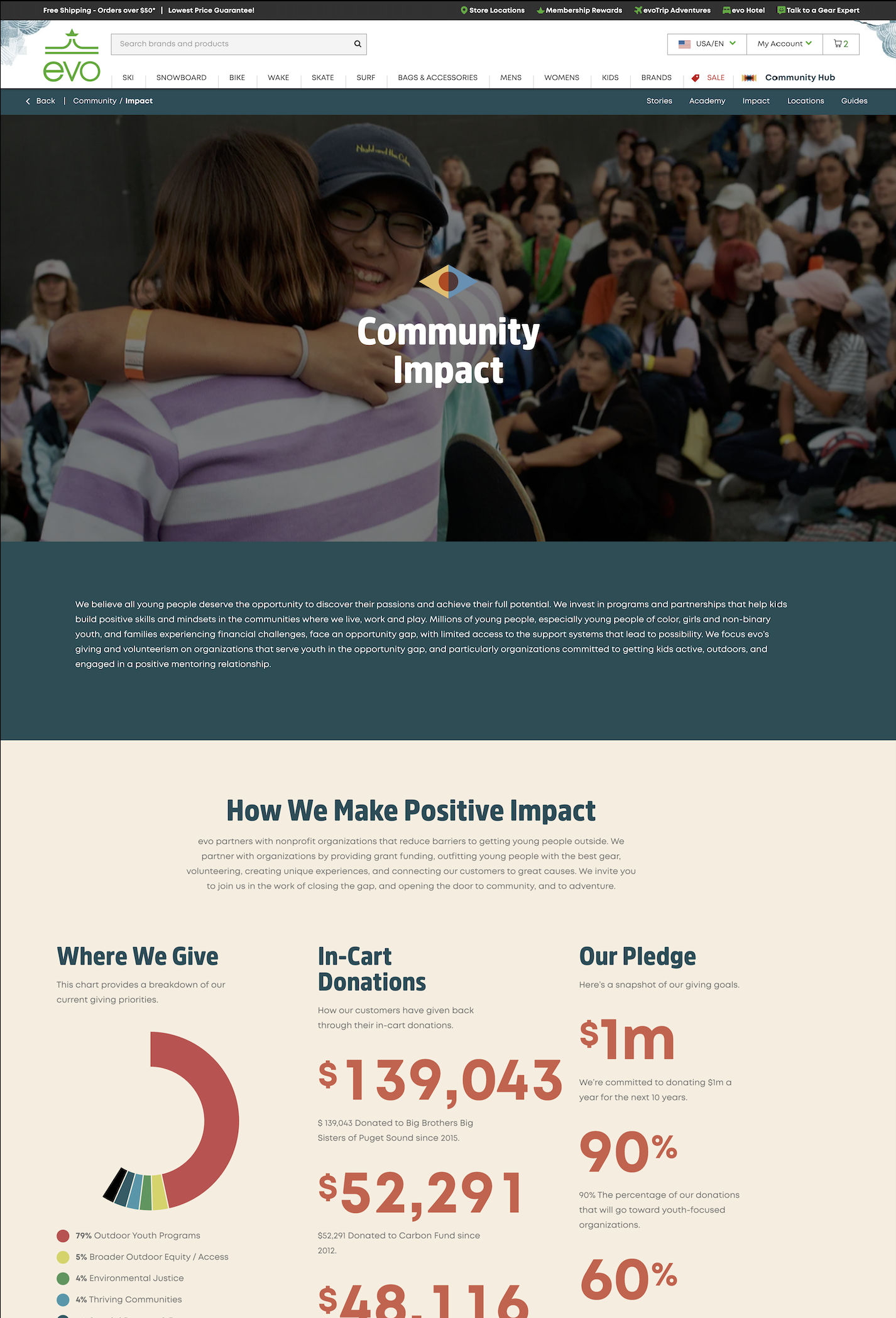
The ResearchUsers trust evo’s intentions, but the Community page could do more to earn trust faster, surface credibility sooner, and support both casual and deeply values-driven users without overwhelming either.
Research Findings
Users care about values, but engage at different depths.
1
Some users actively seek proof and data, while others only need quick credibility signals.
“Show, Don’t Tell” Builds Trust
2
Users distrust vague claims and are sensitive to greenwashing.
Key Information is Easy to Miss
3
Users felt important content was buried due to long scrolling and heavy imagery. The evo aesthetic is appreciated, but excess visuals reduce clarity.
Nonprofits Need Clear Entry Points
4
From a nonprofit lens, users expect obvious paths to partnership and contact. Multiple users cited frustration when contact info is buried or absent.
Research Overview
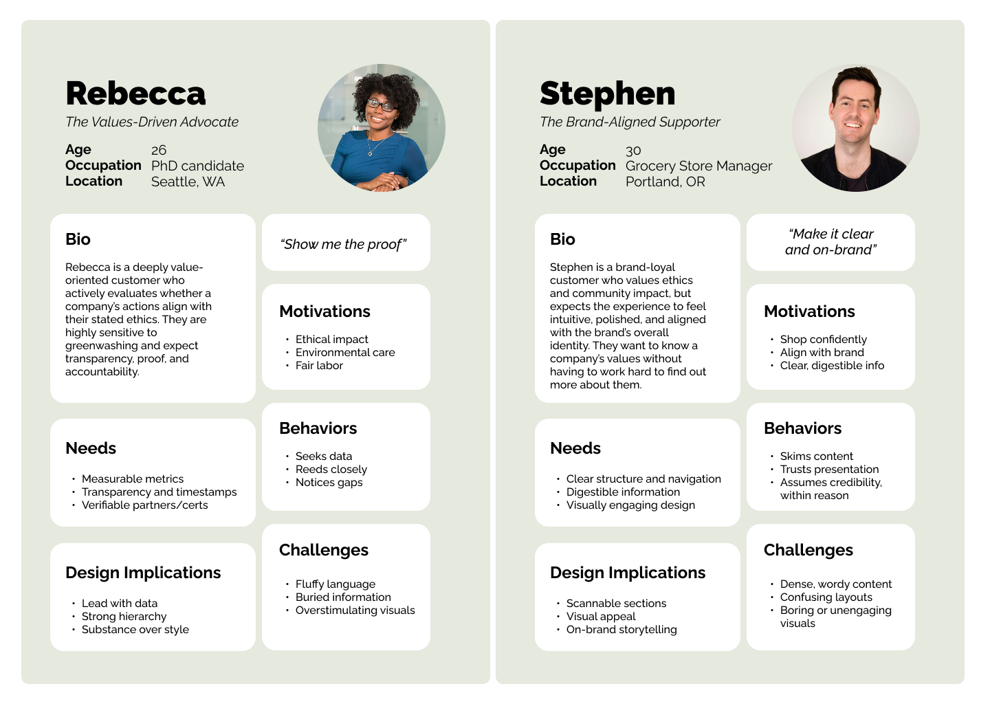
A key insight from the research was that company values matter to everyone, but the level of engagement varies by user type. The chart represents the user type of the interview participants used for this research. The takeaway is that the site must serve multiple depths of engagement. There needs to be quick credibility signals for casual users, and clear pathways to deeper proof for values-driven users.
Identifying the User Types
Asking Ourselves Questions…
How can we preserve evo’s brand look and feel while prioritizing and surfacing important information?
What changes can we make to support both casual browsers and values-driven users without overwhelming either?
How might we reduce scroll fatigue while maintaining visual interest through layered information depth?
What if we found a way to reduce friction for nonprofit engagement that improves usability while signaling openness and transparency?
Finding Solutions
Evo’s customers, casual or loyal, expect and value transparency when it comes to understanding their community impact. By refining hierarchy, transparency, and discoverability on the site, evo’s customers can understand their impact more quickly and trust it more deeply.
01
Bring the values front and center
02
Show real data, right away
03
Make partnerships as easy as clicking a button
Lofi Wireframes
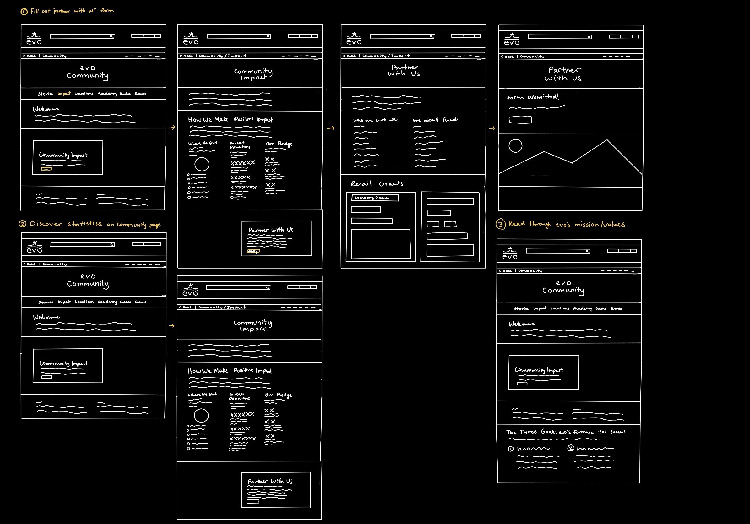
Initial sketches showing the basic layout and flow. Drawing out the ideas and testing early before moving into the design phase is a critical step to ensuring the effectiveness.
Implementing feedback from usability testing
Any modifications to the site have been research-backed and user-led decisions. Each stage of the research and testing process has been completed by evo employees.
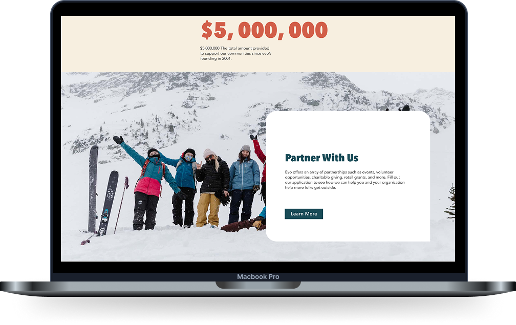
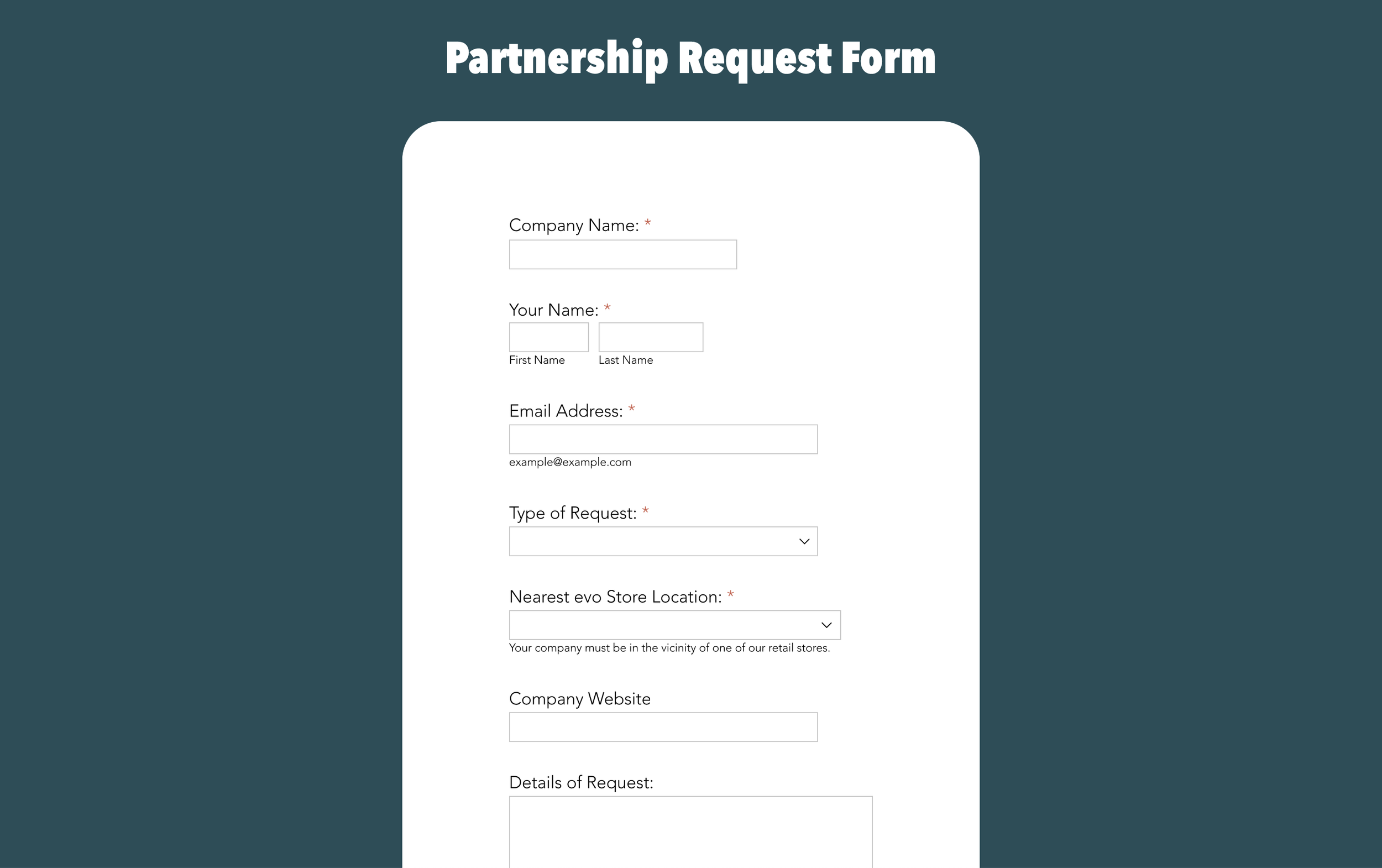
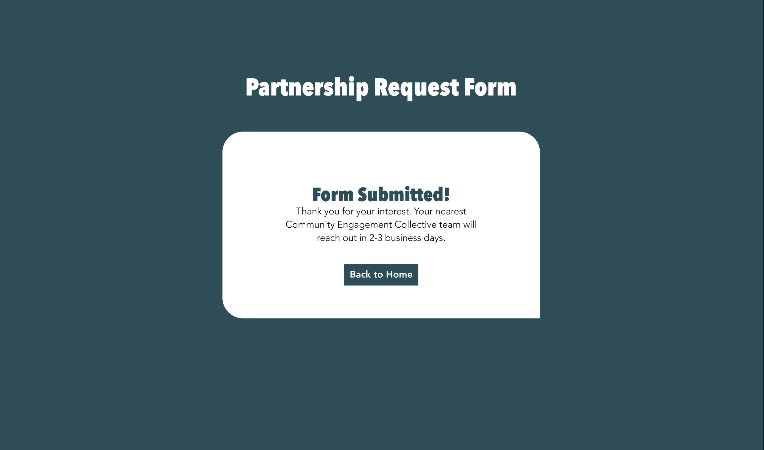
Designing Key Moments
The biggest change was creating an easier way for organizations to get in contact with evo for grants, volunteers, donations, etc. This helps reduce barriers and streamline communication.
The changes made allow evo’s community impact to truly shine. Explore the prototype to see it in action.
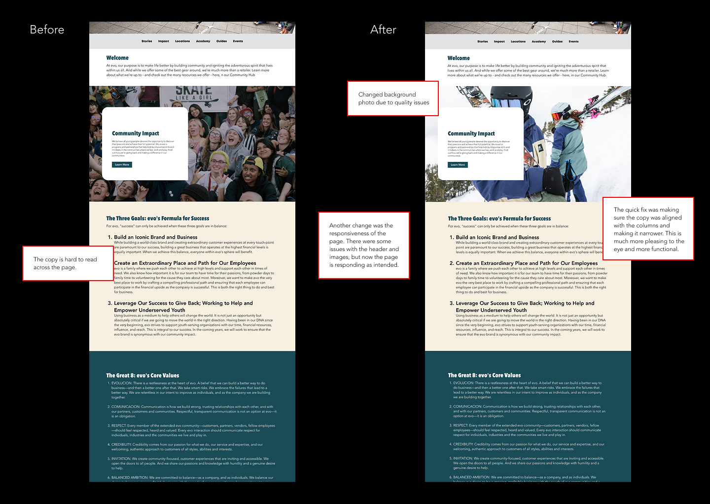
Before and After
Current site design
Final prototype
Conclusion